How to display a legend outside a R plot
If you still don’t use ggplot2 or, as I do, have to use the old and finicky plot() function, read on to discover a trick I use to display a legend outside the plotting area.
As en example, I am going to apply the principal component analysis method to the crabs dataset available in the MASS library. If you’re unfamiliar with the dataset I invite you to read this.
library(MASS)
normalizedCrabs <- crabs[, c(4, 5, 7, 8)] / rowSums(crabs[, c(4, 5, 7, 8)])
pca <- princomp(normalizedCrabs)
We get rid of the qualitative variables sp and sex because the PCA only applies to quantitative variables as well as the index column and the carapace length variable because of a previous analysis we had done which determined that this variable was the one which brought the least amount of information and was very correlated to the others and particularly the carapace width variable.
Moreover, we normalize the data thanks to the rowSums() function.
Next, we plot our PCA according to the first and second components:
png("noLegend.png", width = 400, height = 400)
plot(pca$scores[, 1],
     pca$scores[, 2],
     main = "PCA",
     xlab = "First component",
     ylab = "Second component",
     col = c("deeppink", "blue")[crabs[, 2]],
     pch = c(1, 2)[crabs[, 1]])
dev.off()
Which gives us this:
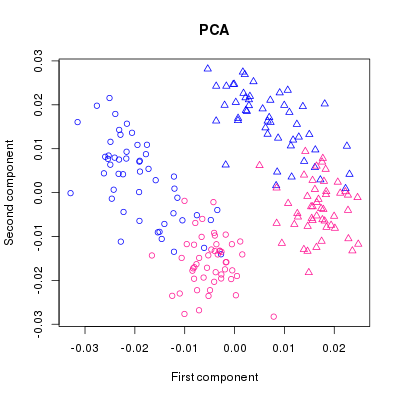
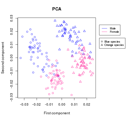
We can clearly see the groups forming and with the help of the colouring we might be able to deduce which sex is which but since a plot is only as good as its legend, we are going to add one:
png("legend.png", width = 450, height = 400)
par(xpd = T, mar = par()$mar + c(0,0,0,7))
plot(pca$scores[, 1],
     pca$scores[, 2],
     main = "PCA",
     xlab = "First component",
     ylab = "Second component",
     col = c("deeppink", "blue")[crabs[, 2]],
     pch = c(1, 2)[crabs[, 1]])
legend(0.03, 0.025,
       c("Male", "Female"),
       col = c("blue", "deeppink"),
       cex = 0.8,
       lwd = 1, lty = 1)
legend(0.03, 0.015,
       c("Blue species", "Orange species"),
       cex = 0.8,
       pch = c(1,2))
par(mar=c(5, 4, 4, 2) + 0.1)
dev.off()
Notice particularly
par(xpd = T, mar = par()$mar + c(0,0,0,7))which allows us to display stuff outside the plotting area. The default value for xpd which is NA means that the plot will cover the whole image. When specifying xpd = T, the plotting will be clipped to the figure region. We then extend the margins on our graph to give us space to display our legends with mar = par()$mar + c(0,0,0,7). Finally, we restore mar to its default value:
par(mar=c(5, 4, 4, 2) + 0.1)Which gives us a way better and more readable plot than before: